The Problems
This was a homegrown CMS that had been built several years ago. As the needs of the business and users changed, feature requests were added and changed to the point where the whole thing was unwieldy. There were patches on top of patches on top of bad functionality. It was a mess.
Eventually the business required functionality that was impossible to add on without a complete overhaul and redesign. I couldn't wait to dig in and fix it.
The Design Process
Competitive Analysis
I took a look at every commercially available CMS on the market including WordPress to get a better picture of what strategies we might benefit from, as well as establish where our CMS might outperform the norm.
Contextual Analysis / User Interviews
We sat with editors as they created content. We then asked them to walk us through the process of writing an article, explaining why they did what they did. We had an outline of questions we wanted to answer, but this was more conversational than questioning. We wanted to fully understand where the pain points were.
We also spoke with Executive Editors to understand how articles are edited and approved for publication. The CMS didn't have any approval or communication functionality so we wanted to explore that possibility.
User Personas
User personas were helpful to understand the different goals and frustrations of the users. Product, design, and dev teams benefit by thinking in terms of real people. We empathize with user personas, even if personas aren't strictly speaking "real" people.
Miranda Sweeney

Age: 28
Location: New York, NY
Position: Senior Editor - Entertainment brands
“Can we, for the love of all that’s holy, get a spell check, please?"
Miranda is an editor for the Entertainment brands, writing primarily for Life & Style. She started as an intern 4 years ago and has worked her way up to a senior position. She is expected to create 7 - 10 articles per day. These articles are usually not the gallery-style posts, though she sometimes creates those when the spirit hits her. When using the CMS, if she doesn’t know what a field is supposed to do, she just ignores it. Her performance is measured by page views per session.
Behavior:
- Furrowed her brow when creating an SEO URL
- Used a separate sheet of notes as a workaround for missing functionality
- The walkthrough - without creating any actual content - took 45 minutes
Goals:
- Write engaging articles about celebrities and their families
- Increase the number of articles submitted per day
- Optimize for the best SEO possible on every article
- Boost recirculation opportunities
Frustrations:
- No spell check
- Workflow is slow - takes 60 - 90 minutes per article
- Sometimes has to work longer than 8 hours per day
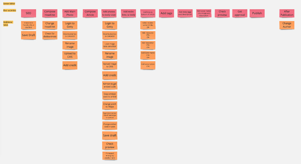
- Uploading, sizing and cropping images requires more than 12 steps
- Unable to specify the pub date
- Hates using html to create a link in the wysiwyg
User Journey Maps
I mapped out the steps editors had to do in order to publish an article in the current CMS. I added the additional tasks required to achieve the main task if there were any. There were obvious multi-step tasks that could be simplified.
Problem / Solution / Benefit Analysis
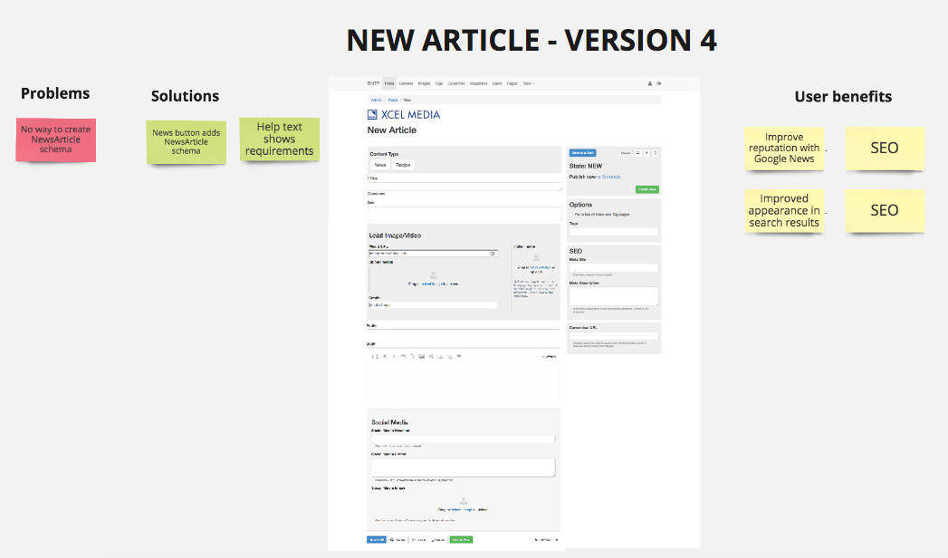
Working with the Product and Dev teams, I proposed a path forward by finding the balance between fixing the most impactful user problems and going for the easy wins. Below are my recommendations to move through 4 stages of development, each improving on the other.
It was useful for Product to see which problems would be solved. It was helpful for Devs to see the hi-fi interactive mockups as they worked through the tickets.
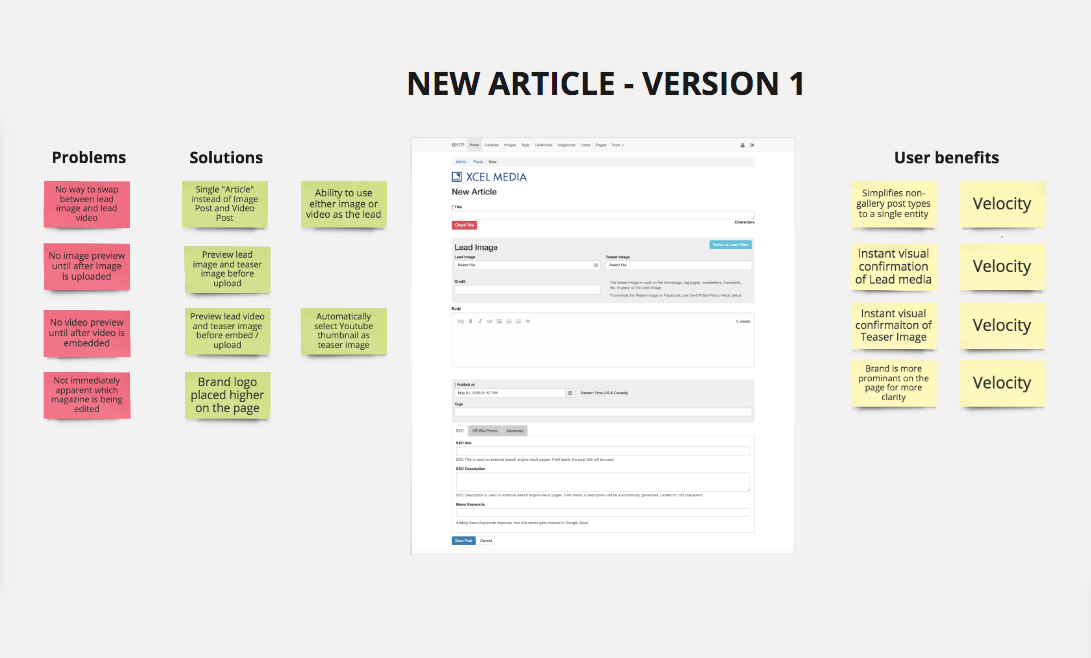
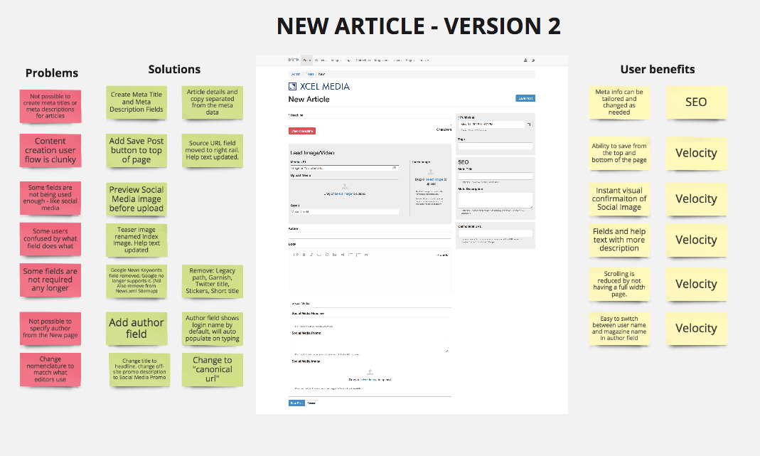
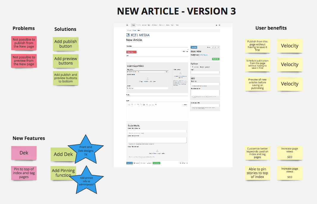
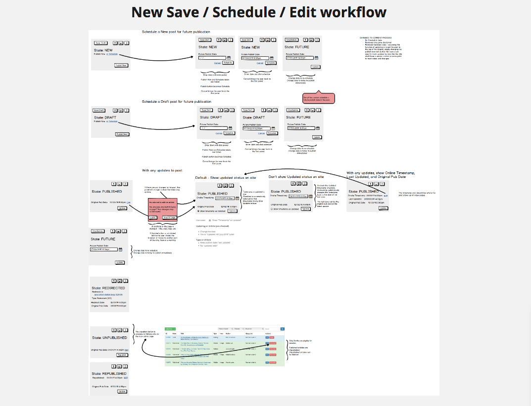
This is an illustration of the new workflow giving editors the option to save, edit, publish or schedule articles. This simplified process eliminated several steps and removed an extraneous page in the CMS.
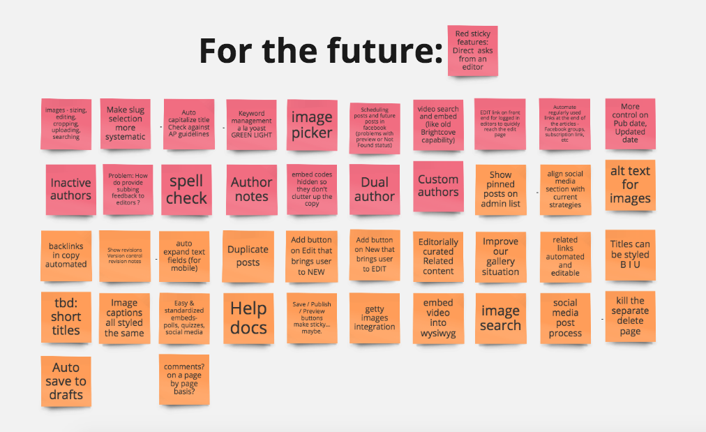
Based on the research and input from users, there were more features for future development.
The CMS was plain ol' bootstrap. Making it prettier was to come after improving the functionality.